Interactive webinars are trending. Now that everyone figured out how to host a webinar, the best marketers have switched to making them interactive. But as you probably know, this isn't the easiest to do. Lots of people give up before achieving success. But that's a bad decision. It's the interaction that leads to people to engage with you and building those relationships help you close deals faster.
If you're looking for engagement techniques, we've written an article on that as well. You can check that out here.
How to engage and interact with your audience is important. But the webinar platform itself is just as important. So let's dive in to the best webinar platforms for interaction.
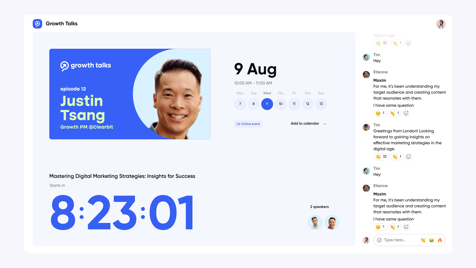
What to look for when you want interaction
- Look and feel of platform
- Modern chat
- Interaction features
- Can you have moderators in the studio
- Free seats
Does the webinar platform feel modern?
Alright, this might seem a weird one. But the experience your viewers have during your webinar does influence how much they interact. People's expectations have changed. They use video platforms like YouTube and Netflix every day. And the one thing these platforms have in common is that they're incredibly easy to use.
If your webinar platform is not incredibly easy to use – and doesn't look modern like let's say Netflix. People will not interact. And in the worst case not even sign up.
Chat to engage your audience
This is where most of your interaction with your audience will take place. So look for one that makes chatting easy. We think the chat should be front and center so that people do not have to search for it.
Just like Netlix shapes people's expectations for video. Slack and WhatsApp changed what people expect from a chat-app. At a minimum, you should look for a webinar platform that has emoji-reactions, reply-to and link unfurls.
Have a webinar moderator
Most likely your speakers are too busy to also handle the chat while speaking. But not handling the chat or waiting until the end is not an option. You want to create flywheels by keeping the conversation going at all times.
So the best thing to do is to have someone working in the background and keeping the chat active. The problem is that there are a lot of webinar platforms where everyone that's a part of the webinar also appears on screen. And it's kind of silly to have somebody on during the webinar that doesn't speak at all.
So look for a webinar platform where it's possible to have people backstage and onstage. This way, you can have somebody manage the chat in the background while the speakers present the webinar.
Look for webinar interaction features
OK, this is a big one. We're assuming here that you're already looking at webinar platforms that have standard interaction features like the chat, Q&A and Polls. But let's be honest. It's 2023 and just check-boxing features doesn't mean people actually use them.
So we're going to do two things.
1) What other interactions feature does the platform have?
2) How easy is it for people to interact with them?
We're using this table to quickly visualize the features they have and in the text itself we will talk about the best interaction features.
| Feature | Contrast |
|---|---|
| Webinar Studio | ✅ |
| Maximum Speakers | 8 |
| Branding Options | ✅ |
| Polls | ✅ |
| Q&A | ✅ |
| Modern Chat | ✅ |
| Emoji reactions | ✅ |
| Reply-to in chat | ✅ |
| GIFs in chat | ❌ |
| Virtual Whiteboard | ✅ (Screen share only) |
| Call-to-actions | ❌ |
| Play videos, GIFs | ✅ |
| Polls | ✅ |
| Animations | ✅ |
| Attendee on stage | ❌ |
Now that we've our criteria of what makes a good and interactive webinar platform. Let's dive into the best webinar platforms for interaction.
Contrast – the new way to run webinars
Contrast is one of the best platforms to engage your audience with. It's a relatively new webinar product, but judging by the reviews on G2, customers seems very satisfied with it.
It also means that they could draw lots of lessons and ideas from other video platforms such as YouTube or Netflix making them one of the most modern platforms on the market.
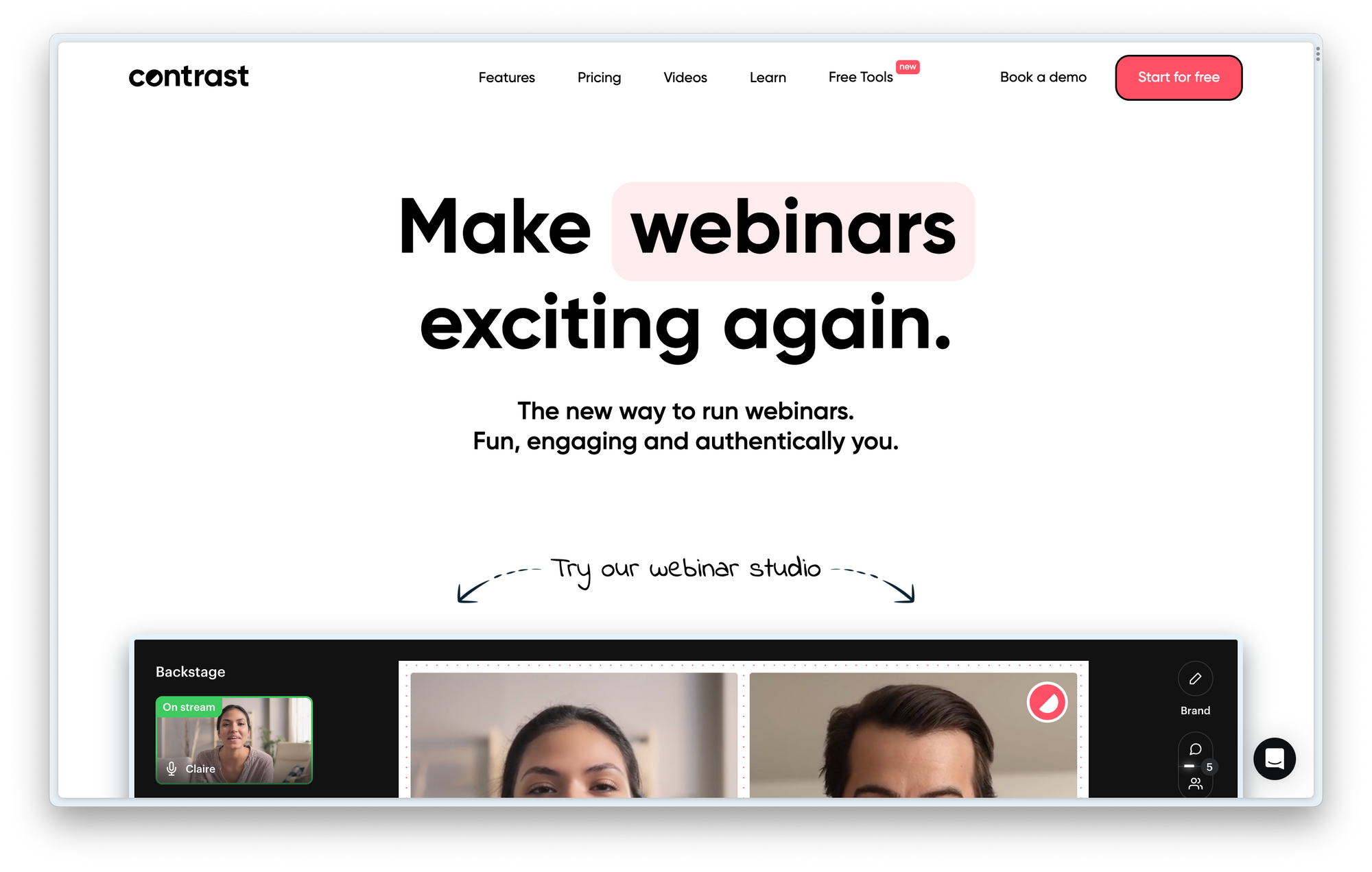
Contrast's look and feel
It's very easy for viewers to register to your webinars and the registration experience looks very modern and on-brand. Here's a screenshot of a webinar on Contrast.
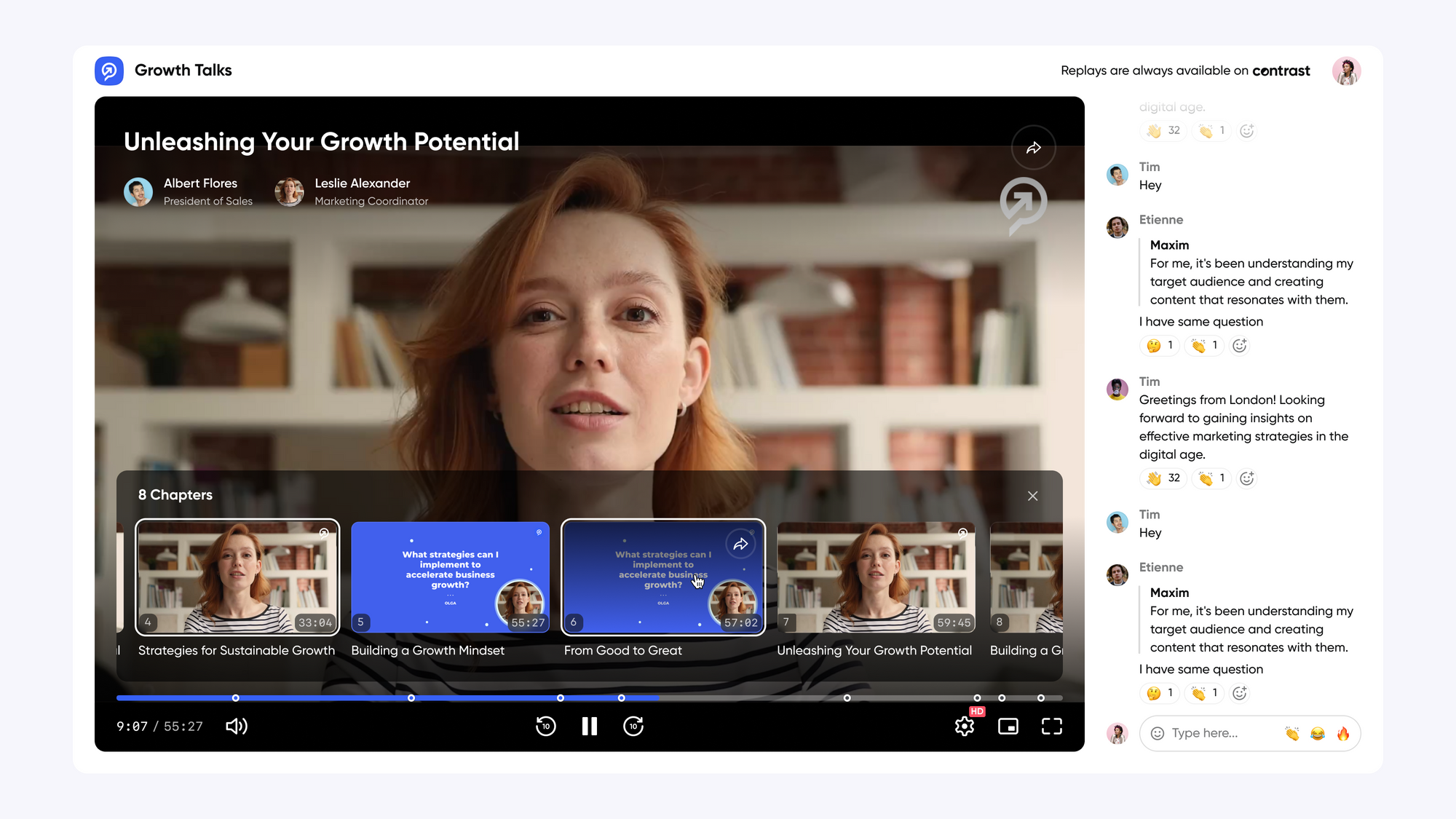
Also the webinar experience itself is easy to use and looks nice. It takes the same branding approach that we have seen on the registration page. Webinar automatically play without people having to refresh the page or click on play.
Next to the video there is a large chat window. Contrast makes all the interaction happen in this same window. Instead of using different windows like other webinar platforms, it's very easy to ask a question (chat) or answer a poll (on top of chat).
The webinar chat on Contrast
Contrast's chat looks modern and emoji-reactions bring liveliness to the chat. It is always possible to reply to people, this way it's a lot easier to follow a conversation when there are multiple people chatting.
Contrary to many other webinar platforms, Contrast has no extra window for questions. This makes it a lot more natural for people to interact in the chat and ask questions. Other people can upvote a question with a simple emoji.
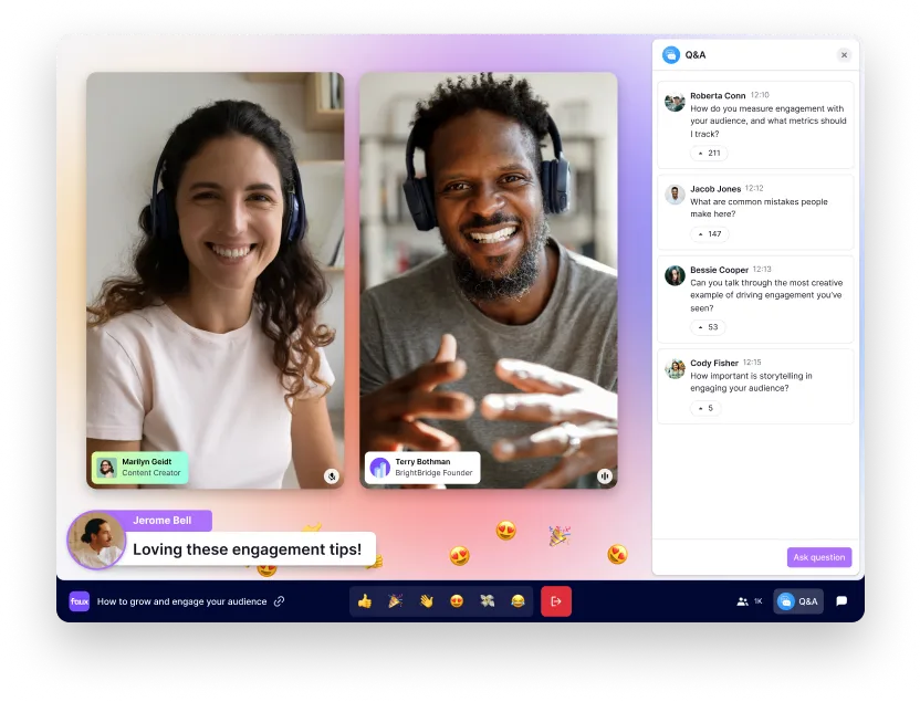
The way speakers can highlight a question from the audience is very original and something that other webinar platforms do not do. Contrast calls this on-stream Q&A and this is what it looks like.
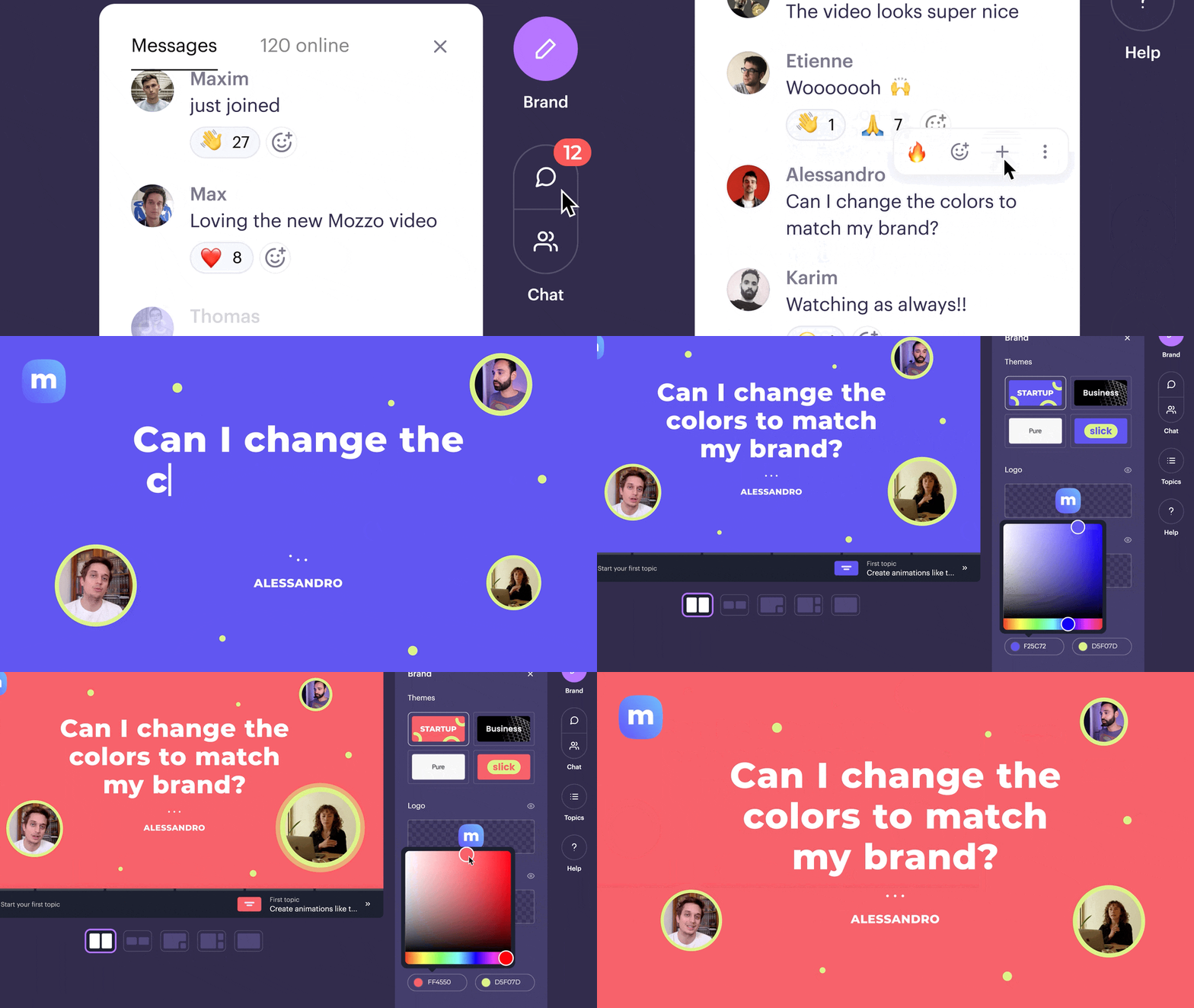
They say that organizing Q&A this way actually helps getting more questions because people love to see their question featured as a part of the webinar.
One thing we noticed though is that Contrast does not support GIFs. So if this is important to you, then it's better to look at another platform.
Moderator and seats on Contrast
Contrast offers unlimited seats on every pricing plan So you don't have to worry about extra costs when you've somebody in the background managing the chat.
Also here Contrast thought about how to manage this without hassle. In their webinar studio there is a backstage and a stage. People in the backstage can listen in on the webinar, chat and control other features. However, people in the audience cannot see or hear these people. That makes it the perfect setup for professionally moderating your webinar while your speakers can focus on the talking.
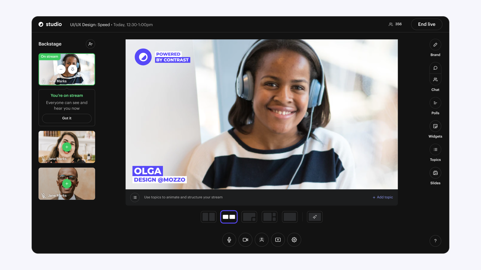
Webinar interaction features on Contrast
The concept of adding something to stream is what makes Contrast the most modern option on the webinar market today. It feels more lively and because you can brand things like Q&A and Polls, they make great content that you can repurpose later on.
What's even more important is that these features are a part of the video. They don't live somewhere in a menu on the side. Because of this, people interact more for example your polls and the chat.
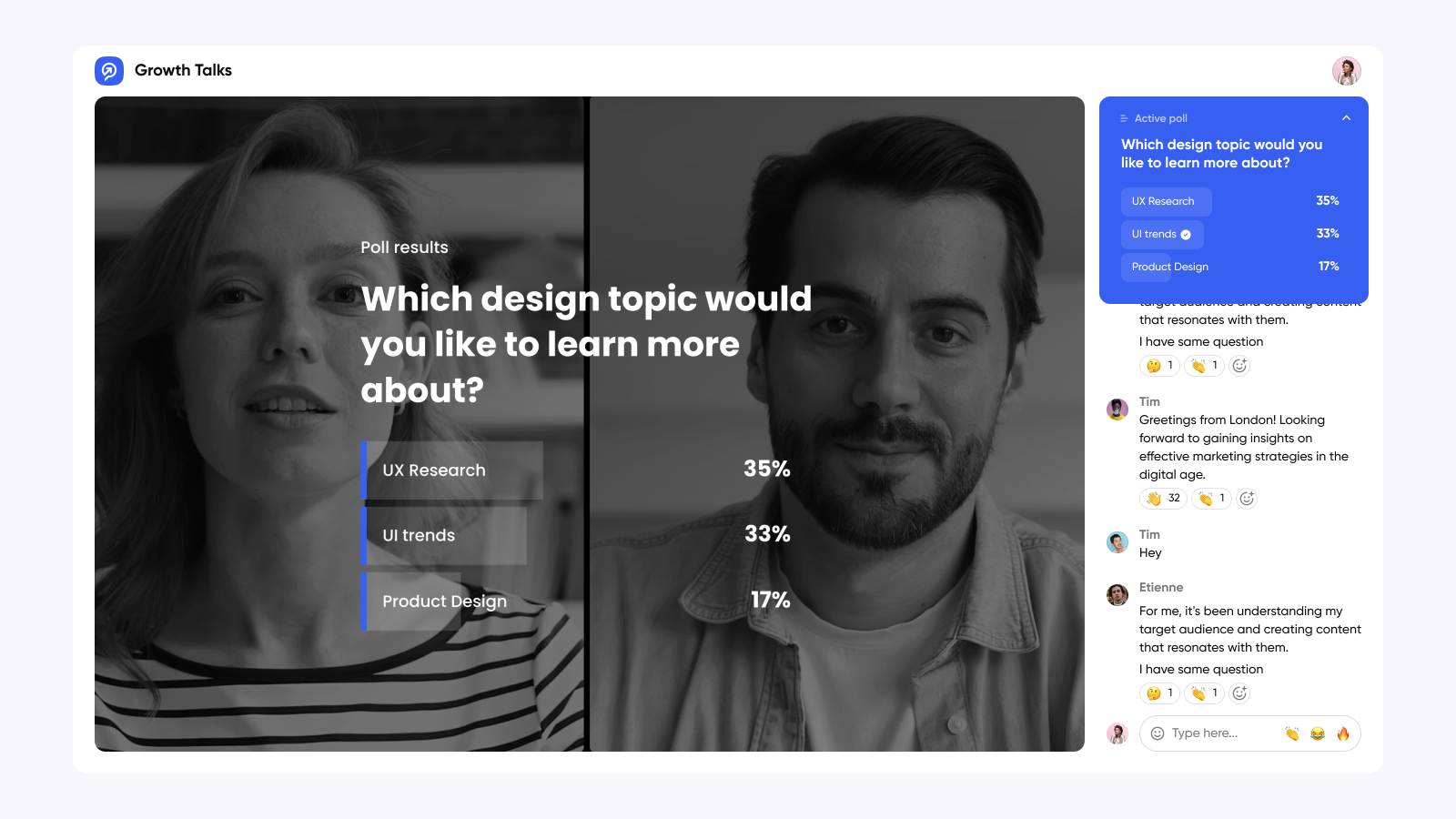
Finally, they have two unique features that we haven't seen so far yet. One is called Topics and it allows you to create animations to better structure your webinar and make your audience follow along.
There are different animations styles that are also branded and change depending on the theme you select. As a bonus, these moments are later saved as clips.
Another feature we liked are what Contrast calls widgets. There's a widget that shows the most trending message in the chat. Another widget is a ticker like you see on TV with the webinar name and your company's socials.
Contrast is missing a few features that other platforms do have. Luckily they are interaction features that most people do not need such as inviting an attendee on stage.
Here's a quick recap of all the interaction features from Contrast
| Feature | Contrast |
|---|---|
| Webinar Studio | ✅ |
| Maximum Speakers | 8 |
| Branding Options | ✅ |
| Polls | ✅ |
| Q&A | ✅ |
| Modern Chat | ✅ |
| Emoji reactions | ✅ |
| Reply-to in chat | ✅ |
| GIFs in chat | ❌ |
| Virtual Whiteboard | ✅ (Screen share only) |
| Call-to-actions | ❌ |
| Play videos, GIFs | ✅ |
| Polls | ✅ |
| Animations | ✅ |
| Attendee on stage | ❌ |
Conclusion on Contrast
Contrast is a great webinar platform for people that are looking to engage and interact with their audience. The way they handle simple things like Q&A and Polls is very unique and something we haven't seen before. It increases interaction and participation throughout the webinar.
The platform feels modern and is extremely easy in use. The chat is modern and although it's missing the support for GIFs, we can easily imagine a constantly active chat with lots of emojis flying around.
Contrast offers a free plan for up to 50 registrants. Their paid plans start at €60,- per month. You can register here without putting in a credit card.
Crowdcast
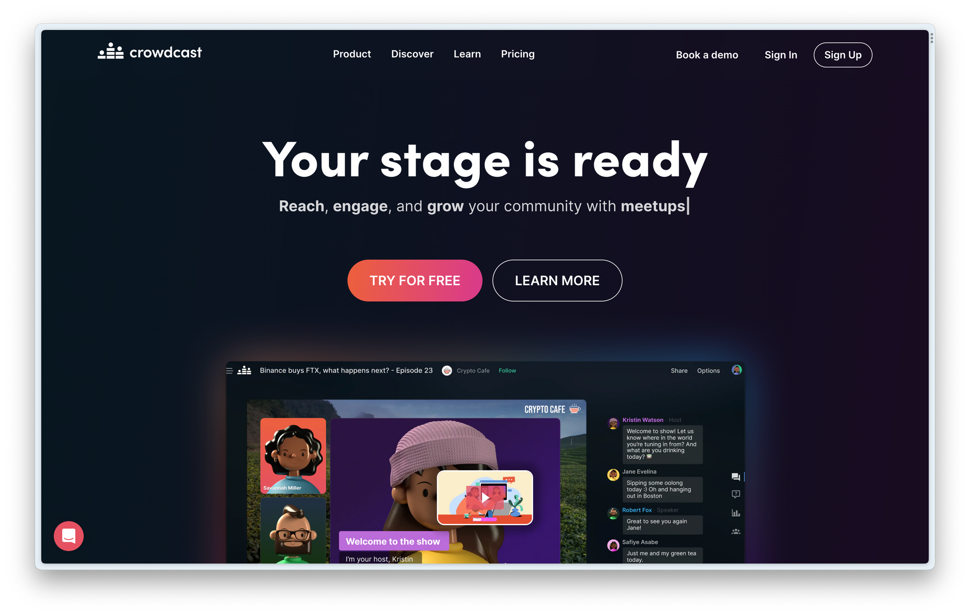
Look and feel
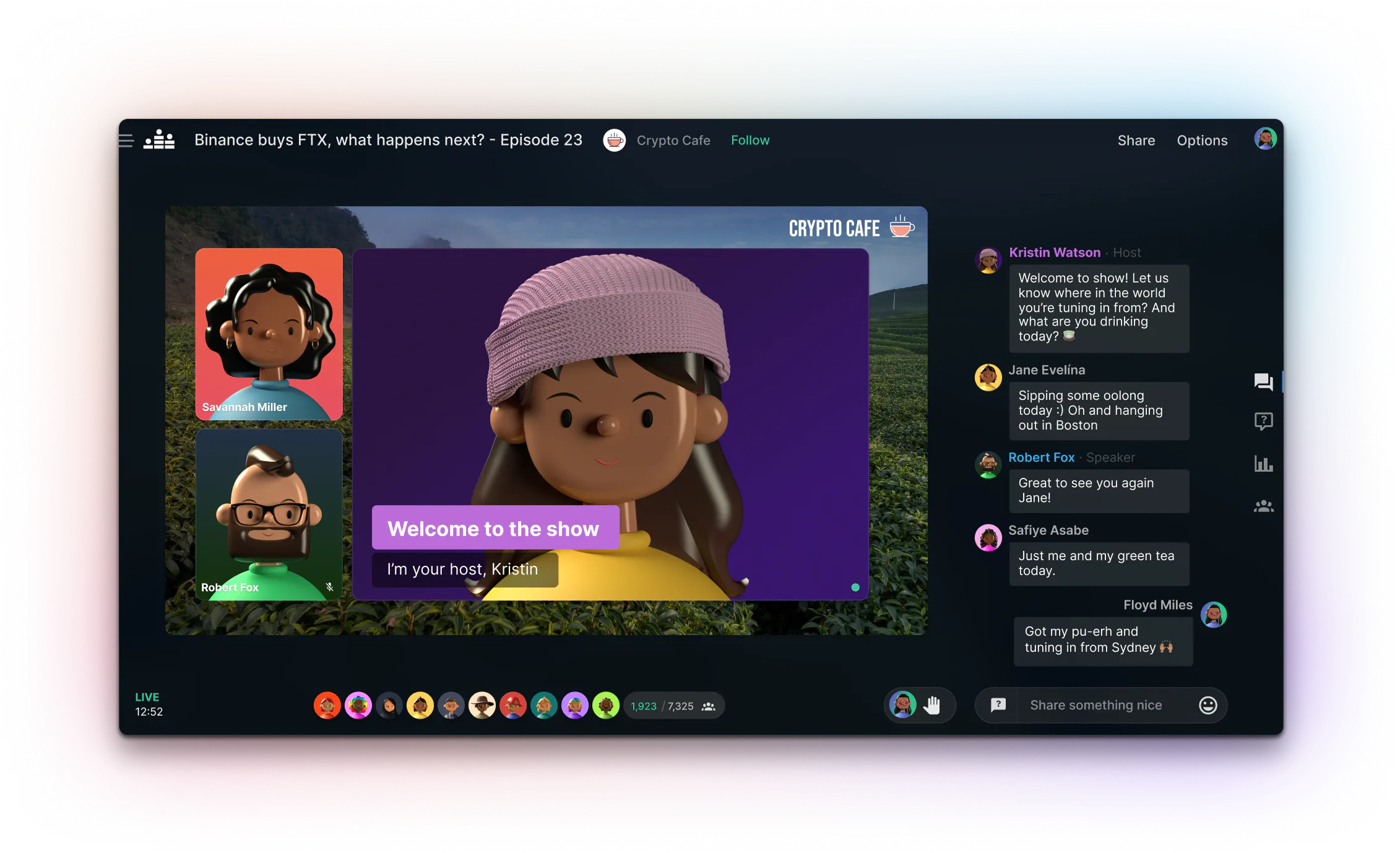
Recently Crowdcast did a revamp of the look and feel of their webinar product. And it looks great! It feels modern and easy to use. However, some more serious businesses and brands might think it looks a little unprofessional. And that makes sense, because it looks like Crowdcast is especially great for communities.
Chat
The chat works great. It looks modern and also Crowdcast offers a way for you to react with emojis to messages. Next to that, you can edit your message if you make a mistake.
Unfortunately also Crowdcast is missing support for GIFs and we didn't find a way to reply-to a certain message. This makes following the chat a little harder when there are a lot of people chatting.
Moderators and seats
Like Contrast, Crowdcast offers you the option to have a moderator on the side. Remember, this is great for interacting with the chat and giving people the feeling they're part of the webinar. On Crowdcast this is called the Wing (backstage on Contrast).
Unfortunately, you need to pay to add more people. With their standard plan, you're only allowed to have 1 host. If you need more, you need to upgrade to a more expensive plan. If you want 4 people, you need to purchase their most expensive plan.
This makes Crowdcast a clunky option for larger marketing teams.
Interaction features
If you're looking for lots of interaction features you should check out Crowdcast. The only downside we can see is that everything is hidden in lots of menus. This makes the user experience worse. As we learned before, this will increase friction for people to interact.
What we especially like is their feature to invite an attendee from the audience on stream. This is a great example of the community focus that Crowdcast has.
| Feature | Crowdcast |
|---|---|
| Webinar Studio | ✅ |
| Maximum Speakers | 4 |
| Branding Options | Limited |
| Polls | ✅ |
| Q&A | ✅ |
| Modern Chat | ✅ |
| Emoji reactions | ✅ |
| Reply-to in chat | ❌ |
| GIFs in chat | ❌ |
| Virtual Whiteboard | ✅ (Screen share only) |
| Call-to-actions | ✅ |
| Play videos, GIFs | ✅ |
| Polls | ✅ |
| Animations | ❌ |
| Attendee on stage | ✅ |
Conclusion on Crowdcast
Crowdcast is a great option for people that have communities and are looking to run interactive live events. They have most of the feature you expect, including some special features like inviting an attendee on stage.
However, if you're looking for a more serious webinar solution. It's best to look somewhere else. The look and feel of Crowdcast is not necessarily professional – and adding extra team members is going to set you back quite a few quid.
Session – by Hopin
Look and feel
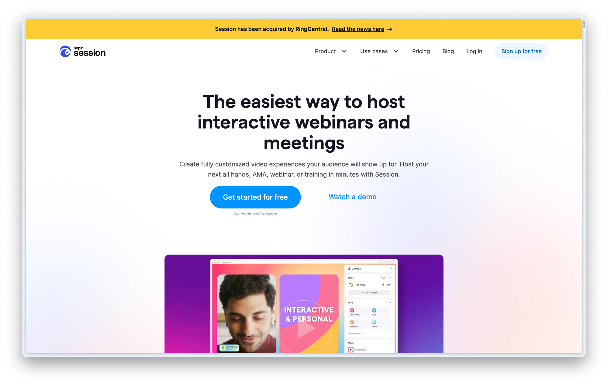
This is a relatively new webinar product, just like Contrast. It has a slightly more oldschool look to it. It looks like it drew a lot of inspiration from the Hopin and Streamyard platform that were designed some years ago.
Chat
The chat is great and has all the features you expect. Including emoji-reactions. Session has decided to separate the chat from Q&A and Polls. Which adds a bit of friction to people using those features.
Moderators and seats
Session also charges you extra if you want more than 1 host. This makes it a less popular option for larger teams. Luckily they have the concept of backstage so that you can always have somebody in the background that manages the chat.
They're a bit cheaper than Crowdcast, so if you need to add more people it's worth checking out Session!
Interaction features
Interaction is one of the things that Session mentions a lot on its homepage. And we get why. They have the features you expect but also some fun ones that other platforms don't have.
Like Contrast, they allow you to add a Q&A onto the webinar's stream. This helps with interaction, because people love to get their question featured. However, it looks like this is not possible with regular chat messages. Unfortunately, Session decided to hide the Q&A feature inside a menu. Adding that bit of extra friction that will decrease interaction.
Special interaction features are the celebration and emoji-reactions. They both allow your viewer to either celebrate with confetti or send emojis to your speakers. They are a bit gimmicky but we can definitely see why someone would love them.
| Feature | Session |
|---|---|
| Webinar Studio | ✅ |
| Maximum Speakers | 1 (more paid) |
| Branding Options | Limited |
| Polls | ✅ |
| Q&A | ✅ |
| Modern Chat | ✅ |
| Emoji reactions | ✅ |
| Reply-to in chat | ❌ |
| GIFs in chat | ✅ |
| Virtual Whiteboard | ✅ (Screen share only) |
| Call-to-actions | ✅ |
| Play videos, GIFs | ✅ |
| Polls | ✅ |
| Animations | ❌ |
| Attendee on stage | ✅ |
Conclusion Session
Session is a nice webinar product with interactive features such as celebrations and emoji reactions. These features will not change your entire webinar, but they add that extra bit of fun. And let's be honest, webinars should be more fun.
Because Session is quite new, they don't have all the webinar features you would normally expect. And because Session recently got acquired, it's unclear what the future of this webinar platform will look like.
The best platform for interaction
Like with everything in life it depends a little on your needs.
We recommend communities to check out Contrast or Crowdcast. Marketing teams that are serious about interaction and data availability within their marketing stack should go with Contrast.
If you're not sure what best fits your needs, you can try Contrast entirely for free with up to 50 registrants. You can use this link to sign up, no credit card needed
