An effective webinar tool can generate a lot of leads for your company. More than 89% of marketers think webinars outperform other channels in generating qualified leads.
Successfully hosting a webinar relies on smart promotion and engaging content. But one of the most important parts of the customer journey is the webinar registration page. It is the first point of friction and sets expectations for your attendees.
The tricky part is getting people to see the value of your webinar. This is where a great webinar registration page comes into play. In this guide, we will break down all the parts that make a webinar registration page compelling and effective in attracting more leads.
We’ll also leave you with 11 great examples to get inspiration from.
Let’s get started!
Elements of a High-Converting Webinar Registration Page
When crafting a webinar registration page that converts, pay attention to these elements:
1. Headline
A good headline gets people interested in your webinar and encourages them to read further on the page. Your headline is the first thing customers see and set their expectations on. After all, visitors may form an impression of your site in as little as 50 milliseconds.
Here are some best practices for creating effective titles:
- Know Your Audience: Tailor your title to your target audience's interests and needs. You can even mention them by name. E.g. Banking Essentials for International Students in Canada.
- Be Specific: Offer to solve a particular problem or issue your customers are facing. E.g. 10x Your eCommerce Workable Leads with Minimal Spend.
- Ask a Question: Questions create curiosity and make people attend the webinar for answers. E.g. What is the Best eCommerce Retention Strategy?
- Use Numbers: Specific numbers boost your credibility and imply measurable benefits. E.g. 10 Secrets on Asana.
- Highlight Experts: Mention any experts and celebrities in your field to attract a captive audience. Even include qualifications, if possible. E.g. How To Write Better Requirements - By Jordan Kyriakidis, CEO, ACME Corp.
- Keep It Crisp: Clear and concise language helps users get the gist of what you’re trying to convey. E.g. How PR & Marketing Teams Win in 2023.
- Optimize for SEO: If you want more people to find your webinar on Google, you should use SEO techniques. These include finding the right keyword and using it in your webinar registration page headline.
2. Description
Craft a concise yet informative description that highlights the value of the webinar. A good description leaves the reader feeling like they know what they’re going to get from the webinar. Use the following tips when crafting a description:
Highlight the Topic: State the subject of the webinar. It should flow from the title and keep the reader hooked.
Outline the Content: A brief overview in bullet points helps the reader know what to expect. This may include main topics, any special features, and takeaways. Short bullet points because most visitors will simply scan the page.
Speaker Information: Speaker information helps you establish credibility with the attendees. For instance, people attending an SEO webinar are more likely to register if a proven SEO expert is a speaker.
Provide Logistical Details: The boring stuff is as important as the fancy stuff. Basic information like the date, time, duration, and any other relevant details are crucial to keep attendees informed. Make sure to share the timezone of your webinar to help global attendees. Buttons for downloadable calendar events make it easier to improve your turnout.
Call to Action (CTA): Use an exciting call-to-action to ensure that interested visitors click to register.
3. Visuals
A study found that users on a landing page are more likely to convert when the page combines text and images. While your words convey meaning, images put those words in context. Here are a few things you can do for great visuals on your webinar registration page:
- Maintain Visual Hierarchy: Headlines, subheadlines, and bolded text create an easy-to-follow visual hierarchy. The same applies to the page as a whole.
- Branding: Use your company logo or branding to provide context. This goes beyond the logo and includes any company colors, layout styles, and fonts.
- Button Colors: The register button should stand out from the rest of the page. Usually, a company can use a bright color from their list of brand colors. But don’t be afraid to use a color that’s not in your company style to make the button pop.
4. Testimonials
Much like speaker credentials, testimonials are a form of social proof. They are the most reliable way to gain credibility with potential customers. 72% of consumers are more likely to trust a business when they read positive reviews and testimonials. The effect is even more pronounced with B2B customers. A whopping 97% of B2B customers said testimonials were the most reliable form of content.
Where possible, use testimonials on your webinar landing page.
5. Optional elements
A basic webinar page should have all the above-mentioned features. But the best free webinar software offers even more features:
- Agenda or Schedule: Today, companies host entire conferences via webinars. The biggest web conferences have multi-session webinars with breakout rooms. In such situations, you should always include a clear agenda.
- Countdown Timer: Countdown timers can help generate anticipation and urgency.
- Social Media Share Buttons: Make sure your webinar attendees can share it with others. Social sharing buttons can boost your visibility and sign-ups.
- FAQ: No matter how well you write your webinar registration page, some attendees will have common questions. You can make things easier by including a Frequently Asked Questions Section below the main information on your page.
- Chatbot: When the FAQ doesn’t answer your users’ questions, a chatbot can help. A chatbot on a registration page can help retain hesitant users by using AI or your team to respond to their questions.
- Bonus Offers: Mention any additional resources, like e-books or whitepapers, that attendees will receive upon signing up. Offering extra resources during a webinar boosts its value, helps people remember, and can get you more registrations.
- Sponsor Logos: If your webinar is sponsored, it’s common practice to show off the sponsor's logos on the page. Sponsor logos can even make your page look more reliable and draw in attendees who know those brands.

Ready to level up your webinar registration pages?
Start for free up to 30 registrants. No credit card needed.
Start for free11 Webinar Registration Page Examples
Here are 10 companies that have done a great job creating webinar registration pages:
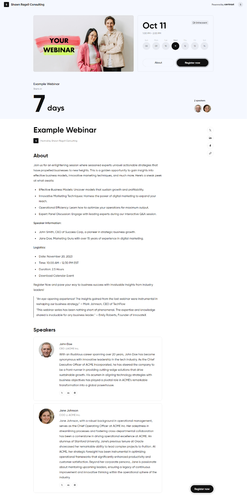
1. Numeral
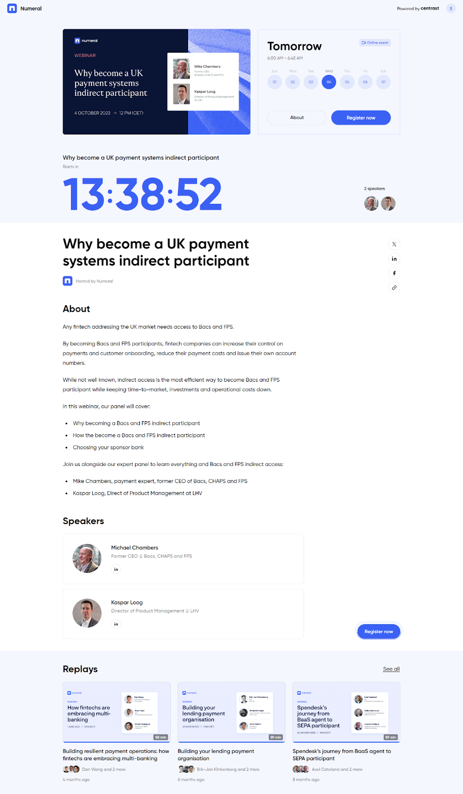
This example from Contrast customer Numeral focuses on creating urgency to get more leads.
- The first thing the reader sees are the number of remaining days (and then hours) until the webinar date
- The integration of a calendar highlights the exact date and time of the webinar.
2. Checkbox.ai
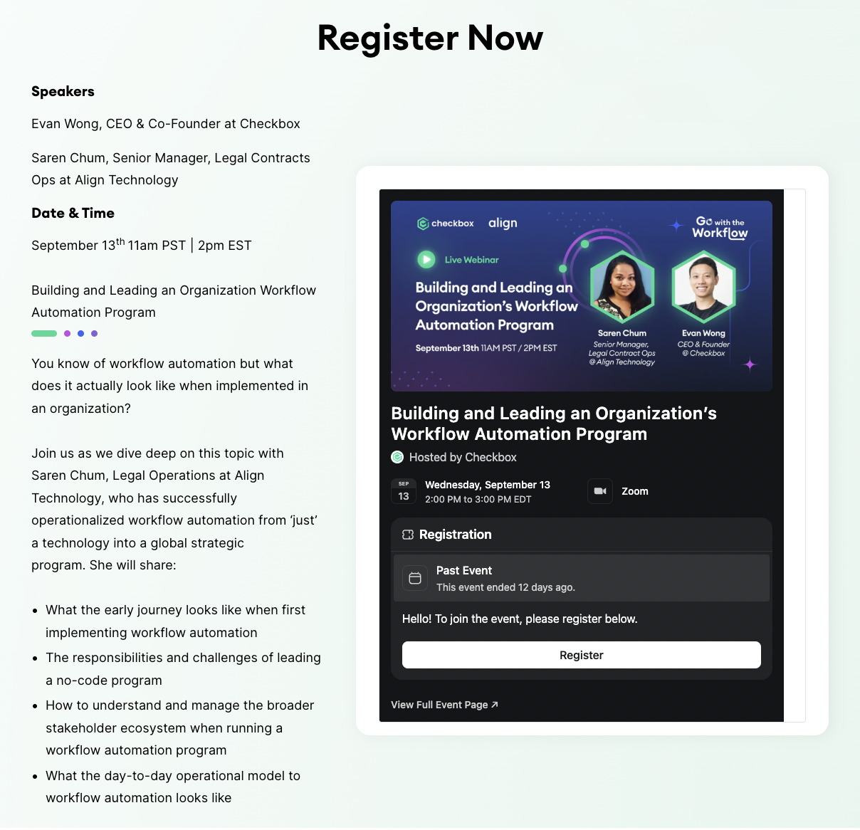
Shown above is the latter half of the Checkbox.ai registration. There are a few things that make this a great webinar page:
- The header image reiterates the logistical information in a black box that stands out from the rest of the page.
- Prominent display of the speakers and their designations.
- Descriptions on the left side show what the webinar is about and the webinar plan.
- The description begins with a question that gets readers interested.
3. Edelkoort
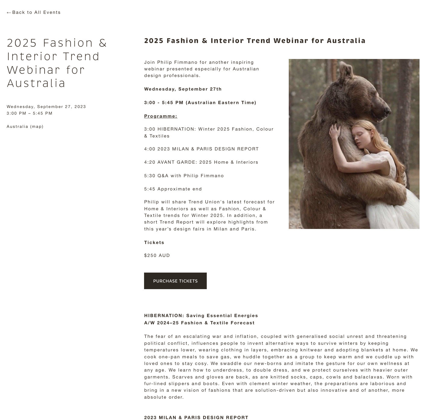
Edelkoort relies on its minimal color scheme to great effect on this page.
- The basic information of the webinar is the first thing the reader sees on top.
- A clear layout of the program schedule draws the eye.
- An intriguing visual that gets you to take a deeper look
4. Modjo
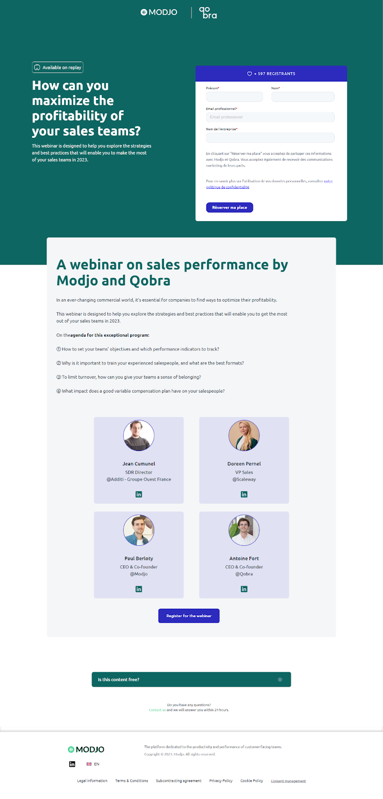
Modjo uses Contrast’s platform to host their webinars. This is a great landing page that has many of the core requirements:
- They use social proof / FOMO in an interesting way by showcasing the number of people who have already registered.
- The form stands out from the green background in blue and white.
- Speaker photos, names, and designations link to LinkedIn for more social proof.
- The “Available on replay” tag tells users that they can see their webinar later on.
- By having only the logo and not a menu on top, the page focuses on the primary conversion goal: registrations.
5. ESI
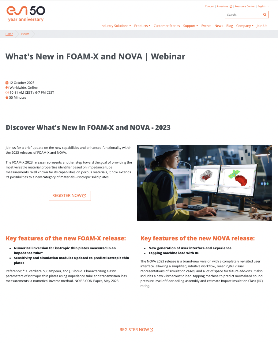
This landing page from Contrast customer ESI is notable for a few reasons:
- The most important details are featured prominently
- Because this is a product update webinar, ESI displays information about both releases.
6. Volvo Group
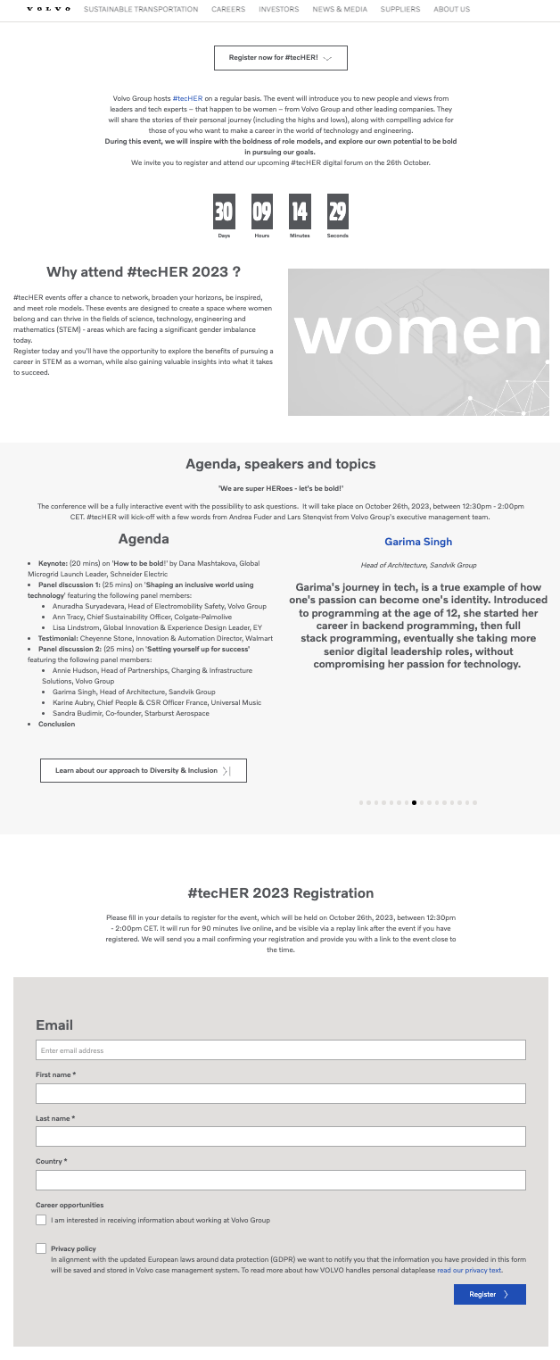
Volvo is a carmaker known for its emphasis on safety and inclusivity. Their webinar page reflects this with:
- Clear agenda labeling.
- A countdown clock that generates urgency.
- A “Why attend” section that answers the biggest question.
- The form only asks customers basic questions, lowering the barrier to entry.
7. Userled
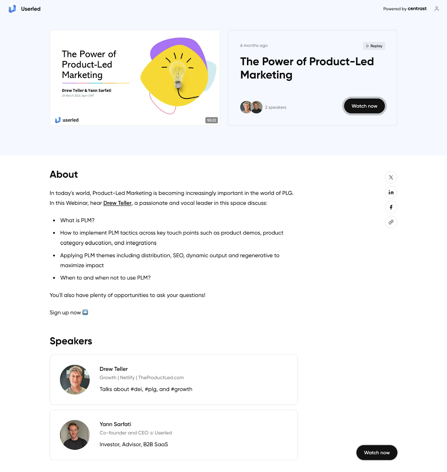
This webinar registration page comes from Contrast customer Userled. There are a few things that make this a great webinar page:
- The page contains a replay of the last webinar. That provides potential attendees with a taste of what to expect and also give a second life to the last webinar.
- The page features an eye-catching banner.
- Simple design that focuses on the core message.
8. Salesforce
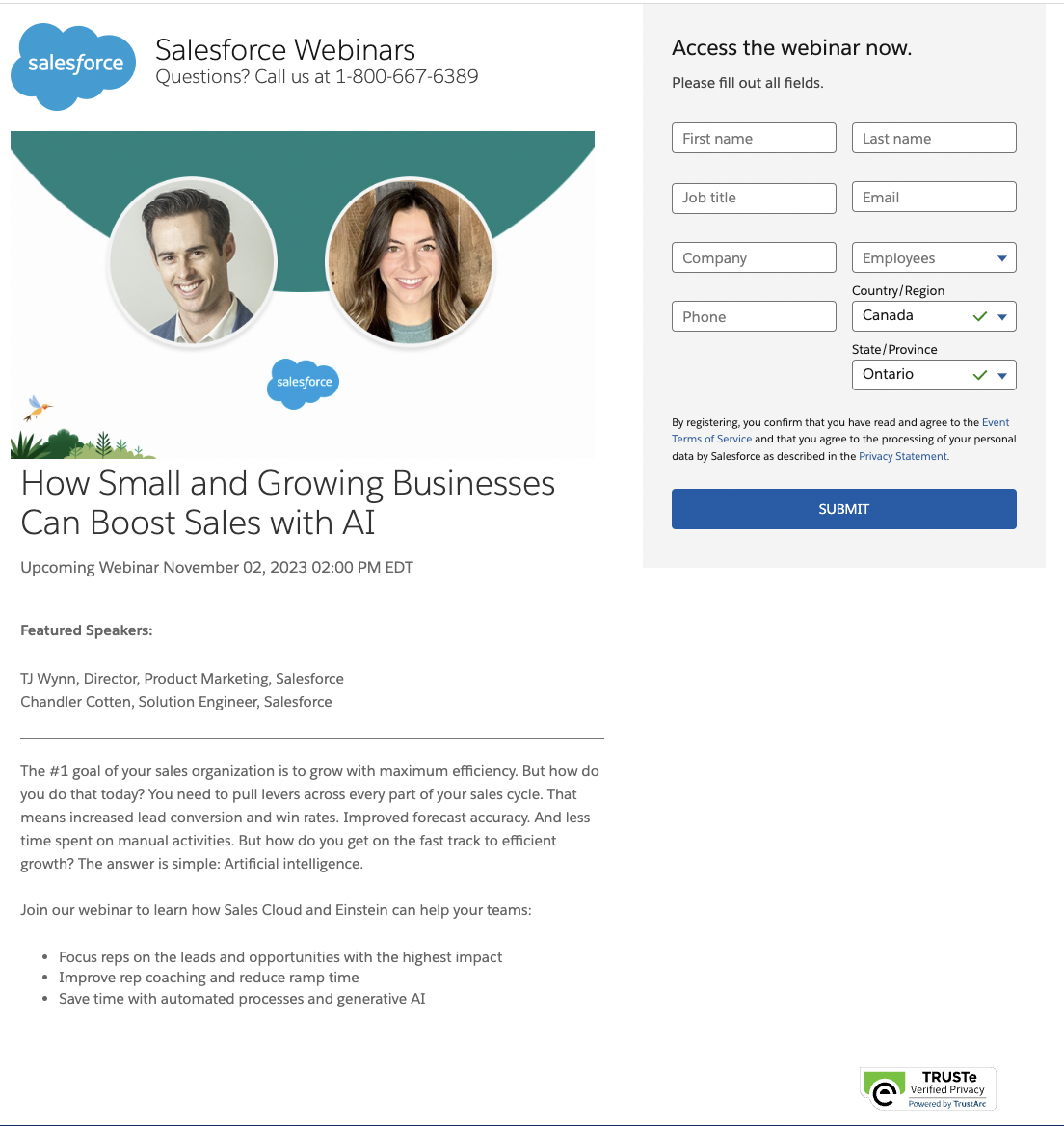
Salesforce shows its maturity as a company with a tight, professional webinar page with a few standout features:
- The header image and the rest of the page reflect Salesforce branding.
- The entire form is “above the fold” on a desktop page.
- The whole description is concise and includes the speaker names and designations.
- One down-side of this page is that the form is really long.
9. S&P Global
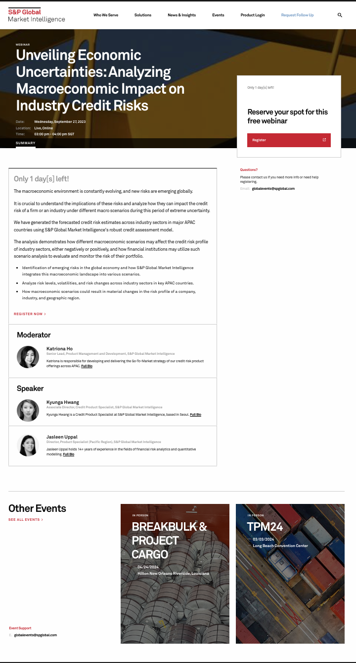
S&P has an excellent webinar page with a few noteworthy features:
- “Only one day left” generates urgency and works like a countdown.
- Though the form isn’t on the page itself, the registration button is prominent in bright red and is above the fold.
- The page gives deep information on the speakers, establishing their credibility with attendees.
- The page also highlights other events that someone might be interested in.
10. Gartner
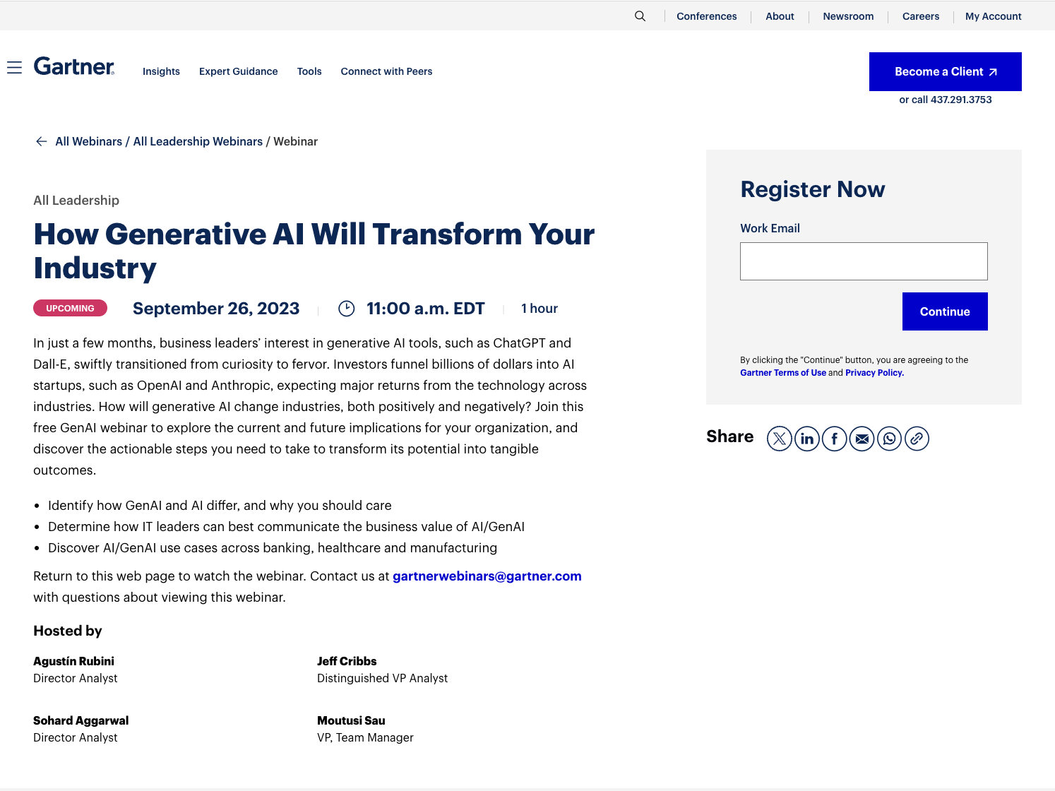
This webinar registration page by Gartner has a few things going for it:
- A wide variety of social share buttons helps spread the word.
- The form is short and above the fold.
- They let you know that the webinar recording will be available at this same URL later.
11. Apaleo
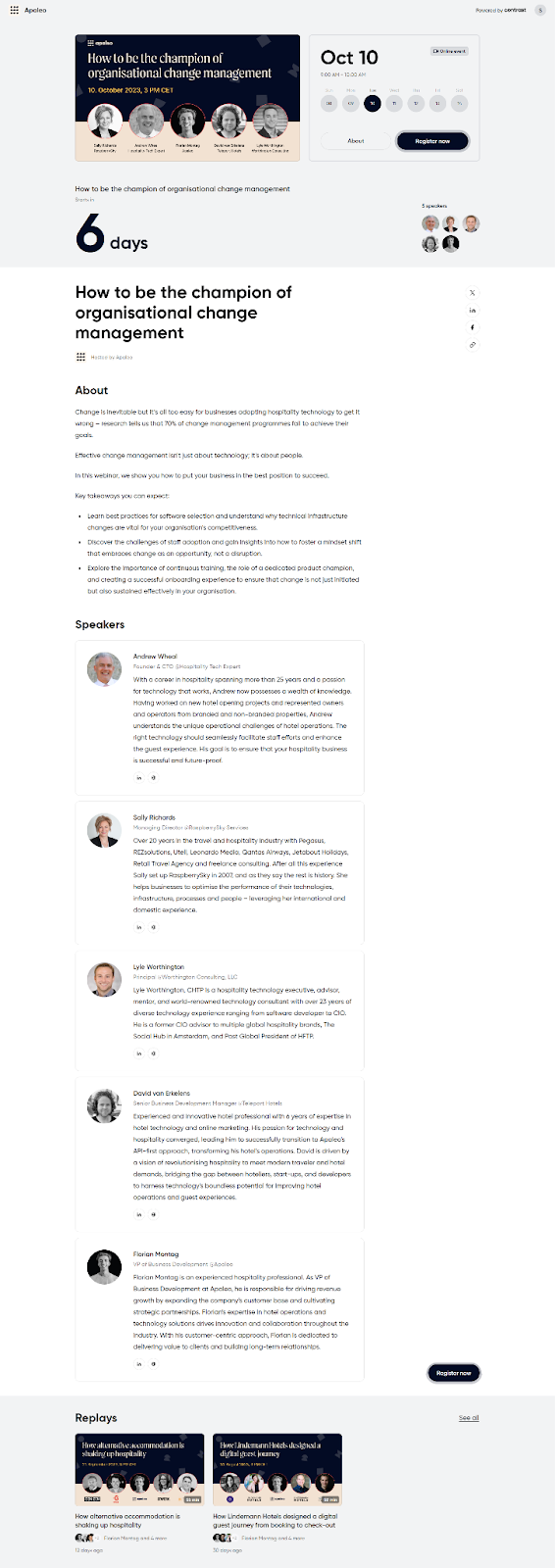
We wanted to highlight Contrast customer Apaleo’s webinar registration page for a few reasons:
- They designed an attractive banner with professional images of the speakers
- Detailed bios of the speakers show their expertise and background
- They list the key takeaways of the webinar.
How to build a webinar registration page with Contrast
Crafting an outstanding webinar registration page is essential for the success of your webinar. The vast majority of marketers believe webinars provide more reliable leads compared to other mediums. Your webinar registration page is where potential attendees first get to know what to expect and how to get involved.
Building a great webinar registration page (and hosting webinars) is easy with Contrast’s webinar platform. We built our platform to be easy to use but with powerful features. Here’s a quick look at how you can customize your webinar registration page:
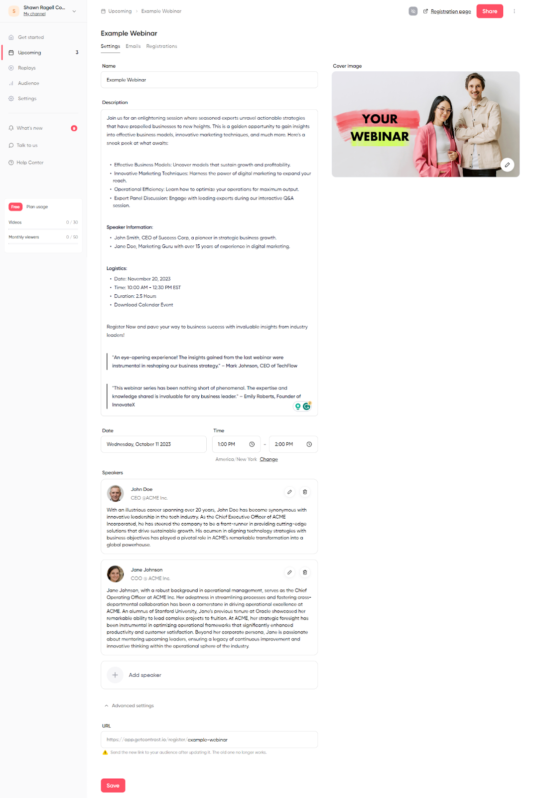
- Our webinar registration page editor makes it easy to add a cover image and all of your webinar details
- Add speakers easily and customize their profile pictures and bios. You can even link to their social profiles.
- Choose your brand's color and logos
- No more messing with code or a clunky CMS. Our editor is easy to use and creates good looking webinar registration pages in minutes:
Contrast’s ease of use and advanced features make it possible for beginners to even advanced marketers to get up and running quickly.
Ready to level up your webinar registration pages?
Start for free up to 30 registrants. No credit card needed.
Start for free